bokeh로 봉차트(Candlestick Chart) 그리기
파이썬에서 봉차트를 제공하는 라이브러리가 많지 않습니다. 필자는 matplotlib에서 떨어져 나온 mpl_finance와 bokeh 정도로 알고 있습니다. 이미 mpl_finance로 봉차트를 그리는 방법은 이전 포스트 Matplotlib으로 봉차트(Candlestick Chart) 그리기 에서 다루었습니다.
이번 포스트에서 bokeh로 봉차트를 그리는 방법에 대해서 다루겠습니다. bokeh는 Anaconda에서 개발 중인 차트 라이브러리 입니다. matplotlib과 matplotlib 기반인 seaborn과는 다르게 독자 노선을 가지는 라이브러리 입니다. bokeh는 웹에 최적화 되어있는 라이브러리 입니다. matplotlib을 웹브라우저에 띄우려면 차트를 png 등의 그림으로 변환하여 보여줘야 해서 응답형(reponsible) 차트를 웹에 띄우기가 어렵습니다. 그래서 보통 웹에 차트를 띄울 때는 데이터만 서버에서 받고 Chart.js와 D3.js 같은 자바스크립트 라이브러리를 사용하여 데이터를 가시화 합니다. bokeh는 파이썬에서 차트를 가시화하고 그 결과를 쉽게 웹에 띄울 수 있는 여러 방법을 제공합니다. 이 포스트에서는 다루지 않겠습니다.
bokeh에서 봉차트를 제공하고 있습니다. bokeh 봉차트 문서에서 상세한 정보를 확인해 보세요.
먼저 Anaconda3가 설치되어 있는 상태라 가정하고 글을 이어나가겠습니다. Jupyter Lab(Notebook)에서 bokeh가 잘 설치되어 있는지 확인합니다.
from bokeh.io import output_notebook, showfrom bokeh.plotting import figure, gridplotoutput_notebook()BokehJS 0.12.16 successfully loaded.
이렇게 로딩이 성공되었다는 메시지가 뜨는지 확인합니다. 만약 다음과 같은 메시지가 뜬다면 Jupyter Lab의 Extension을 설치해야 합니다.
Loading BokehJS ...JavaScript output is disabled in JupyterLabAnaconda Prompt에서 다음과 같이 jupyterlab_bokeh 확장을 설치합니다.
jupyter labextension install jupyterlab_bokeh설치가 되지 않는다면 아마도 node.js가 설치되어 있지 않아서일 것입니다. 그렇다면 conda install nodejs를 통해 먼저 node.js를 설치하고 다시 jupyterlab_bokeh 확장을 설치합니다.
bokeh가 잘 설치되어 있다면 이제 봉차트를 그릴 준비가 되었습니다. 차트 데이터는 다음과 같이 ['date', 'open', 'high', 'low', 'close', 'volume']의 리스트로 있습니다.
import pandas as pddata = [['20190219', 125000.0, 127500.0, 123500.0, 126000.0, 57757], ['20190220', 125000.0, 127000.0, 124500.0, 126000.0, 68453], ['20190221', 125500.0, 126000.0, 124000.0, 125000.0, 43961], ['20190222', 125000.0, 125000.0, 123500.0, 125000.0, 31065], ['20190225', 125500.0, 126000.0, 124000.0, 125500.0, 45852], ['20190226', 125000.0, 127000.0, 124500.0, 126500.0, 37404], ['20190227', 126500.0, 127000.0, 124500.0, 126000.0, 36131], ['20190228', 126500.0, 127000.0, 124500.0, 125000.0, 69474], ['20190304', 124500.0, 125500.0, 122500.0, 123500.0, 65517], ['20190305', 123000.0, 125000.0, 122000.0, 124500.0, 35186], ['20190306', 124000.0, 124500.0, 122500.0, 123500.0, 35449], ['20190307', 123500.0, 124000.0, 122000.0, 123500.0, 34768], ['20190308', 122500.0, 122500.0, 120500.0, 121500.0, 35118], ['20190311', 121500.0, 122500.0, 120000.0, 122500.0, 39576], ['20190312', 123000.0, 124000.0, 122000.0, 123500.0, 24117], ['20190313', 123000.0, 123500.0, 121500.0, 123500.0, 37649], ['20190314', 123000.0, 124000.0, 122000.0, 123500.0, 95132], ['20190315', 123000.0, 128000.0, 123000.0, 126500.0, 107246], ['20190318', 127000.0, 131000.0, 126500.0, 131000.0, 74644], ['20190319', 130000.0, 134000.0, 129500.0, 133000.0, 68348], ['20190320', 132000.0, 133000.0, 129500.0, 131000.0, 42697], ['20190321', 130000.0, 132000.0, 127500.0, 128500.0, 54018], ['20190322', 127500.0, 129500.0, 126500.0, 127000.0, 32380], ['20190325', 125500.0, 126500.0, 124000.0, 124500.0, 37185], ['20190326', 124500.0, 125500.0, 123500.0, 124000.0, 45161], ['20190327', 124000.0, 125000.0, 123500.0, 124000.0, 34336], ['20190328', 124000.0, 124500.0, 120500.0, 121500.0, 43518], ['20190329', 122500.0, 125000.0, 122000.0, 124500.0, 39035], ['20190401', 124000.0, 126500.0, 124000.0, 126500.0, 22463], ['20190402', 125500.0, 126500.0, 123500.0, 126000.0, 31754], ['20190403', 124500.0, 128000.0, 124500.0, 128000.0, 36250], ['20190404', 128500.0, 128500.0, 126000.0, 128000.0, 34854], ['20190405', 127500.0, 129000.0, 126000.0, 127500.0, 33513], ['20190408', 127500.0, 128000.0, 126000.0, 128000.0, 39005], ['20190409', 128000.0, 129000.0, 127500.0, 128500.0, 33266], ['20190410', 128000.0, 129000.0, 126500.0, 128000.0, 64476], ['20190411', 128500.0, 129000.0, 125000.0, 125000.0, 84802], ['20190412', 126000.0, 127500.0, 125500.0, 127000.0, 39663], ['20190415', 126500.0, 128500.0, 126000.0, 127000.0, 61140], ['20190416', 127000.0, 129000.0, 126500.0, 128500.0, 40123], ['20190417', 128500.0, 129000.0, 127000.0, 128000.0, 30846], ['20190418', 128000.0, 128500.0, 124000.0, 124500.0, 55346], ['20190419', 124500.0, 125000.0, 122000.0, 123000.0, 53439], ['20190422', 123000.0, 123500.0, 121000.0, 122500.0, 30421], ['20190423', 122500.0, 123500.0, 120500.0, 121500.0, 54997], ['20190424', 122500.0, 122500.0, 119500.0, 120000.0, 63486], ['20190425', 121000.0, 121000.0, 118500.0, 119000.0, 36046], ['20190426', 118500.0, 119500.0, 117000.0, 119000.0, 43749], ['20190429', 119000.0, 119500.0, 117000.0, 119500.0, 33516], ['20190430', 122000.0, 123000.0, 119000.0, 119500.0, 94118], ['20190502', 118500.0, 122000.0, 118000.0, 121000.0, 56723], ['20190503', 121000.0, 122000.0, 119500.0, 120000.0, 35240], ['20190507', 118500.0, 119500.0, 117000.0, 117500.0, 44453], ['20190508', 116500.0, 117000.0, 115000.0, 116500.0, 52805], ['20190509', 117000.0, 117000.0, 113000.0, 113000.0, 116012], ['20190510', 113000.0, 114500.0, 110000.0, 111500.0, 86072], ['20190513', 110500.0, 110500.0, 107500.0, 108500.0, 70847], ['20190514', 107500.0, 108000.0, 105000.0, 106500.0, 92820], ['20190515', 107000.0, 107500.0, 105000.0, 107000.0, 68937], ['20190516', 107000.0, 107500.0, 104000.0, 105000.0, 64047]]df = pd.DataFrame(data, columns=['date', 'open', 'high', 'low', 'close', 'volume'])| date | open | high | low | close | volume |
|---|---|---|---|---|---|
| 20190219 | 125000.0 | 127500.0 | 123500.0 | 126000.0 | 57757 |
| 20190220 | 125000.0 | 127000.0 | 124500.0 | 126000.0 | 68453 |
| 20190221 | 125500.0 | 126000.0 | 124000.0 | 125000.0 | 43961 |
| 20190222 | 125000.0 | 125000.0 | 123500.0 | 125000.0 | 31065 |
| 20190225 | 125500.0 | 126000.0 | 124000.0 | 125500.0 | 45852 |
| 20190226 | 125000.0 | 127000.0 | 124500.0 | 126500.0 | 37404 |
| 20190227 | 126500.0 | 127000.0 | 124500.0 | 126000.0 | 36131 |
| 20190228 | 126500.0 | 127000.0 | 124500.0 | 125000.0 | 69474 |
| 20190304 | 124500.0 | 125500.0 | 122500.0 | 123500.0 | 65517 |
| 20190305 | 123000.0 | 125000.0 | 122000.0 | 124500.0 | 35186 |
| 20190306 | 124000.0 | 124500.0 | 122500.0 | 123500.0 | 35449 |
| 20190307 | 123500.0 | 124000.0 | 122000.0 | 123500.0 | 34768 |
| 20190308 | 122500.0 | 122500.0 | 120500.0 | 121500.0 | 35118 |
| 20190311 | 121500.0 | 122500.0 | 120000.0 | 122500.0 | 39576 |
| 20190312 | 123000.0 | 124000.0 | 122000.0 | 123500.0 | 24117 |
| 20190313 | 123000.0 | 123500.0 | 121500.0 | 123500.0 | 37649 |
| 20190314 | 123000.0 | 124000.0 | 122000.0 | 123500.0 | 95132 |
| 20190315 | 123000.0 | 128000.0 | 123000.0 | 126500.0 | 107246 |
| 20190318 | 127000.0 | 131000.0 | 126500.0 | 131000.0 | 74644 |
| 20190319 | 130000.0 | 134000.0 | 129500.0 | 133000.0 | 68348 |
| 20190320 | 132000.0 | 133000.0 | 129500.0 | 131000.0 | 42697 |
| 20190321 | 130000.0 | 132000.0 | 127500.0 | 128500.0 | 54018 |
| 20190322 | 127500.0 | 129500.0 | 126500.0 | 127000.0 | 32380 |
| 20190325 | 125500.0 | 126500.0 | 124000.0 | 124500.0 | 37185 |
| 20190326 | 124500.0 | 125500.0 | 123500.0 | 124000.0 | 45161 |
| 20190327 | 124000.0 | 125000.0 | 123500.0 | 124000.0 | 34336 |
| 20190328 | 124000.0 | 124500.0 | 120500.0 | 121500.0 | 43518 |
| 20190329 | 122500.0 | 125000.0 | 122000.0 | 124500.0 | 39035 |
| 20190401 | 124000.0 | 126500.0 | 124000.0 | 126500.0 | 22463 |
| 20190402 | 125500.0 | 126500.0 | 123500.0 | 126000.0 | 31754 |
| 20190403 | 124500.0 | 128000.0 | 124500.0 | 128000.0 | 36250 |
| 20190404 | 128500.0 | 128500.0 | 126000.0 | 128000.0 | 34854 |
| 20190405 | 127500.0 | 129000.0 | 126000.0 | 127500.0 | 33513 |
| 20190408 | 127500.0 | 128000.0 | 126000.0 | 128000.0 | 39005 |
| 20190409 | 128000.0 | 129000.0 | 127500.0 | 128500.0 | 33266 |
| 20190410 | 128000.0 | 129000.0 | 126500.0 | 128000.0 | 64476 |
| 20190411 | 128500.0 | 129000.0 | 125000.0 | 125000.0 | 84802 |
| 20190412 | 126000.0 | 127500.0 | 125500.0 | 127000.0 | 39663 |
| 20190415 | 126500.0 | 128500.0 | 126000.0 | 127000.0 | 61140 |
| 20190416 | 127000.0 | 129000.0 | 126500.0 | 128500.0 | 40123 |
| 20190417 | 128500.0 | 129000.0 | 127000.0 | 128000.0 | 30846 |
| 20190418 | 128000.0 | 128500.0 | 124000.0 | 124500.0 | 55346 |
| 20190419 | 124500.0 | 125000.0 | 122000.0 | 123000.0 | 53439 |
| 20190422 | 123000.0 | 123500.0 | 121000.0 | 122500.0 | 30421 |
| 20190423 | 122500.0 | 123500.0 | 120500.0 | 121500.0 | 54997 |
| 20190424 | 122500.0 | 122500.0 | 119500.0 | 120000.0 | 63486 |
| 20190425 | 121000.0 | 121000.0 | 118500.0 | 119000.0 | 36046 |
| 20190426 | 118500.0 | 119500.0 | 117000.0 | 119000.0 | 43749 |
| 20190429 | 119000.0 | 119500.0 | 117000.0 | 119500.0 | 33516 |
| 20190430 | 122000.0 | 123000.0 | 119000.0 | 119500.0 | 94118 |
| 20190502 | 118500.0 | 122000.0 | 118000.0 | 121000.0 | 56723 |
| 20190503 | 121000.0 | 122000.0 | 119500.0 | 120000.0 | 35240 |
| 20190507 | 118500.0 | 119500.0 | 117000.0 | 117500.0 | 44453 |
| 20190508 | 116500.0 | 117000.0 | 115000.0 | 116500.0 | 52805 |
| 20190509 | 117000.0 | 117000.0 | 113000.0 | 113000.0 | 116012 |
| 20190510 | 113000.0 | 114500.0 | 110000.0 | 111500.0 | 86072 |
| 20190513 | 110500.0 | 110500.0 | 107500.0 | 108500.0 | 70847 |
| 20190514 | 107500.0 | 108000.0 | 105000.0 | 106500.0 | 92820 |
| 20190515 | 107000.0 | 107500.0 | 105000.0 | 107000.0 | 68937 |
| 20190516 | 107000.0 | 107500.0 | 104000.0 | 105000.0 | 64047 |
bokeh를 이용해 봉차트를 그려봅니다. 먼저 데이터에서 양봉과 음봉에 대한 mask를 저장합니다.
inc = df.close >= df.opendec = df.open > df.closeinc는 양봉, dec는 음봉에 해당합니다. 이제 봉들을 그려줍니다. 하나의 봉은 bokeh에서 segment와 vbar로 구성되어 있습니다. segment는 high와 low까지 선으로 그은 봉의 꼬리를 그리는데 사용됩니다. vbar로는 봉의 몸통을 그립니다.
p_candlechart = figure(plot_width=1050, plot_height=200, x_range=(-1, len(df)), tools="crosshair")p_candlechart.segment(df.index[inc], df.high[inc], df.index[inc], df.low[inc], color="red")p_candlechart.segment(df.index[dec], df.high[dec], df.index[dec], df.low[dec], color="blue")p_candlechart.vbar(df.index[inc], 0.5, df.open[inc], df.close[inc], fill_color="red", line_color="red")p_candlechart.vbar(df.index[dec], 0.5, df.open[dec], df.close[dec], fill_color="blue", line_color="blue")봉차트 밑에 거래량 막대차트(Bar Chart)까지 그려 줍니다. 이 때도 vbar를 사용하면 됩니다.
p_volumechart = figure(plot_width=1050, plot_height=100, x_range=p_candlechart.x_range, tools="crosshair")p_volumechart.vbar(df.index, 0.5, df.volume, fill_color="black", line_color="black")그리고 마지막으로 위 차트들을 gridplot으로 배치하여 가시화합니다.
p = gridplot([[p_candlechart], [p_volumechart]], toolbar_location=None)show(p)이 코드들을 모아서 다음과 같은 봉차트를 그릴 수 있습니다.
from bokeh.io import show, output_filefrom bokeh.plotting import figurefrom bokeh.layouts import gridplot
inc = df.close >= df.opendec = df.open > df.close
p_candlechart = figure(plot_width=1050, plot_height=200, x_range=(-1, len(df)), tools="crosshair")p_candlechart.segment(df.index[inc], df.high[inc], df.index[inc], df.low[inc], color="red")p_candlechart.segment(df.index[dec], df.high[dec], df.index[dec], df.low[dec], color="blue")p_candlechart.vbar(df.index[inc], 0.5, df.open[inc], df.close[inc], fill_color="red", line_color="red")p_candlechart.vbar(df.index[dec], 0.5, df.open[dec], df.close[dec], fill_color="blue", line_color="blue")
p_volumechart = figure(plot_width=1050, plot_height=100, x_range=p_candlechart.x_range, tools="crosshair")p_volumechart.vbar(df.index, 0.5, df.volume, fill_color="black", line_color="black")
p = gridplot([[p_candlechart], [p_volumechart]], toolbar_location=None)show(p)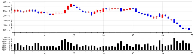
그러나 여기서 각 axis에 표시된 레이블들이 유용한 정보를 주지 못하고 있습니다. 좀 더 보기 좋게 레이블들을 포메팅 해보겠습니다.
p_candlechart.yaxis[0].formatter = NumeralTickFormatter(format='0,0')p_candlechart.xaxis.visible = Falsep_candlechart의 y 레이블을 다음과 같이 천단위로 콤마를 붙인 숫자로 표현합니다.
여기서 x 레이블은 거래량 차트에만 표시하기 위해서 숨기도록 합니다.
p_volumechart의 x 레이블을 날짜로 표현하고 y 레이블을 숫자로 표현합니다.
major_label = { i: date.strftime('%Y%m%d') for i, date in enumerate(pd.to_datetime(df["date"]))}major_label.update({len(df): ''})p_volumechart.xaxis.major_label_overrides = major_labelp_volumechart.yaxis[0].formatter = NumeralTickFormatter(format='0,0')x 레이블의 마지막 값은 잘려서 나와서 숨겼습니다. 이제 이 코드들을 추가해서 다시 봉차트를 그려봅니다.
from bokeh.io import show, output_filefrom bokeh.plotting import figurefrom bokeh.layouts import gridplotfrom bokeh.models.formatters import NumeralTickFormatter
inc = df.close >= df.opendec = df.open > df.close
p_candlechart = figure(plot_width=1050, plot_height=200, x_range=(-1, len(df)), tools="crosshair")p_candlechart.segment(df.index[inc], df.high[inc], df.index[inc], df.low[inc], color="red")p_candlechart.segment(df.index[dec], df.high[dec], df.index[dec], df.low[dec], color="blue")p_candlechart.vbar(df.index[inc], 0.5, df.open[inc], df.close[inc], fill_color="red", line_color="red")p_candlechart.vbar(df.index[dec], 0.5, df.open[dec], df.close[dec], fill_color="blue", line_color="blue")p_candlechart.yaxis[0].formatter = NumeralTickFormatter(format='0,0')p_candlechart.xaxis.visible = False
p_volumechart = figure(plot_width=1050, plot_height=100, x_range=p_candlechart.x_range, tools="crosshair")p_volumechart.vbar(df.index, 0.5, df.volume, fill_color="black", line_color="black")major_label = {    i: date.strftime('%Y%m%d') for i, date in enumerate(pd.to_datetime(df["date"]))}major_label.update({len(df): ''})p_volumechart.xaxis.major_label_overrides = major_labelp_volumechart.yaxis[0].formatter = NumeralTickFormatter(format='0,0')
p = gridplot([[p_candlechart], [p_volumechart]], toolbar_location=None)show(p)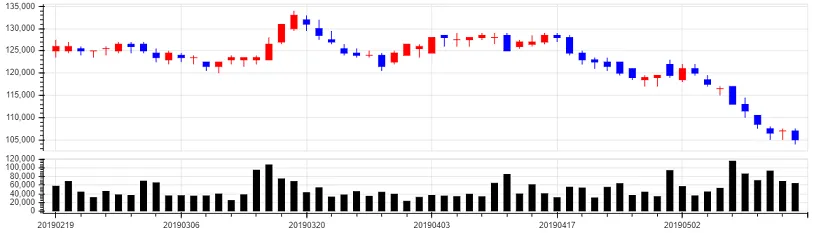
이렇게 x축은 날짜가, y축은 숫자가 보기좋게 나오게 됩니다. 이 차트를 html, json 등으로 웹에 넣어줄 수 있습니다. 자세한 사항은 bokeh 문서 Embedding Plots and Apps를 확인해 주세요.